The go-to colors in kitchens have seen quite the change as of late. Preferred palettes have gone from safe and sleek to warm and layered, and it's a switch that designers say will continue into 2027.
A few key kitchen colors are being swapped out right now, both because clients feel more confident in their selections and because some shades that were once most popular now feel a little flat and dated. So, before you pick up the brush and paint your cooking space, here are the kitchen color swaps designers are making right now, and the timeless hues they're using instead for a warm, inviting scheme.
1. Green Swapped Out for Brown
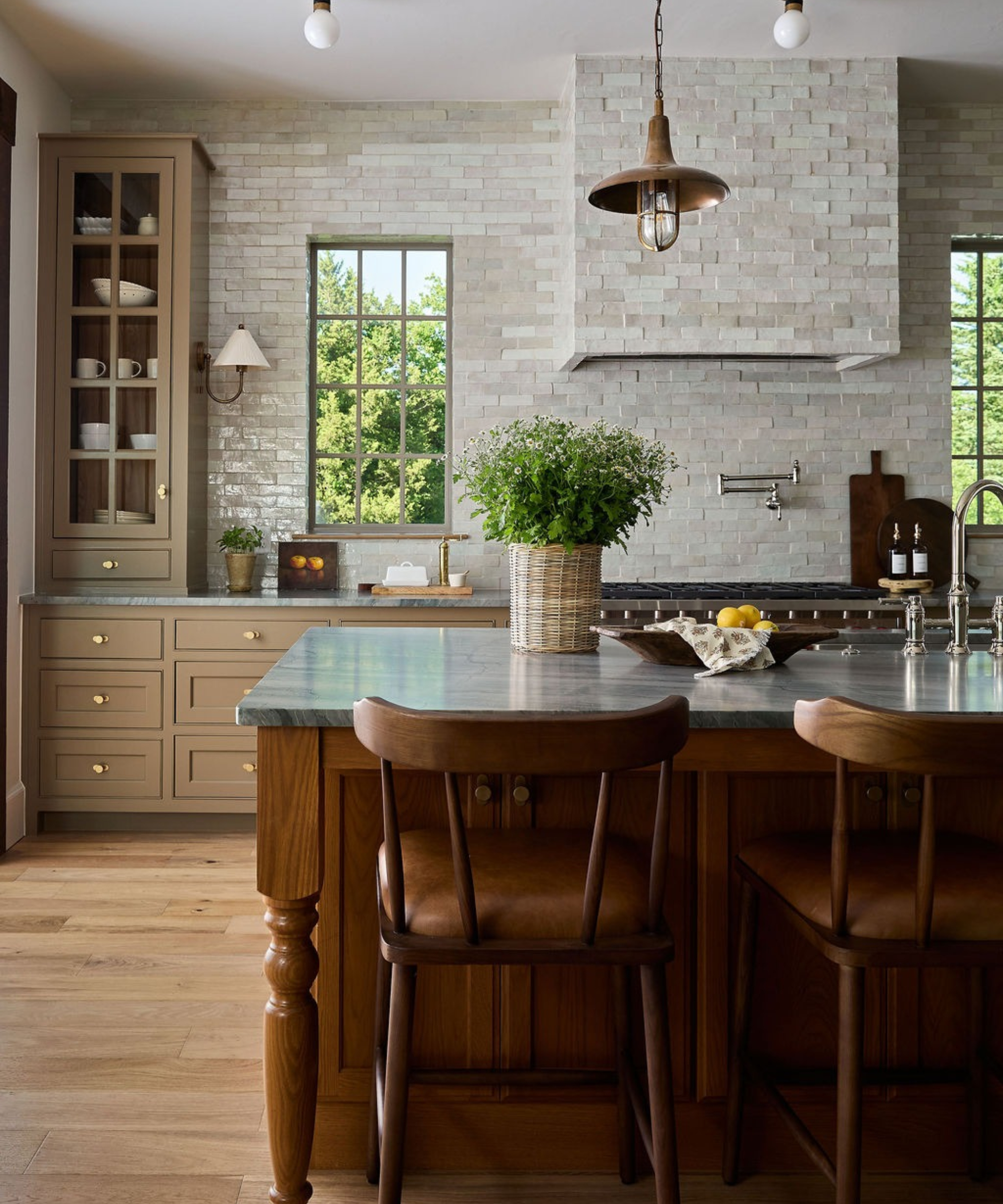
Some kitchen color trends become incredibly dominant, and over the past few years, green has become one of them. So many shades have come in and out of style, from sage and mint to forest and emerald. And while it's a palette that will always have a place, designers say they are swapping it out for something a little less expected.
'Green has been a thing for a long time. When people went to paint their kitchens, they would think of green. And listen, I love a green kitchen. I've done a green kitchen. But I'm moving away from them because I think everything is moving toward stained kitchens,' says Kelsey McGregor, Founder and Principal Designer at Kelsey Leigh Design Co.
'If you can't stain your kitchen, then we're picking a brown. I'm loving brown kitchens, and it can mean so many things. It can be brown-green, brown-red, brown-plum, or brown-brown. It can be a light brown, a taupey brown, or even a really light taupey brown, like those mushroom-colored cabinets. That's what we're putting in kitchens right now.'
2. Whites Replaced by Earthy Neutrals and Wood
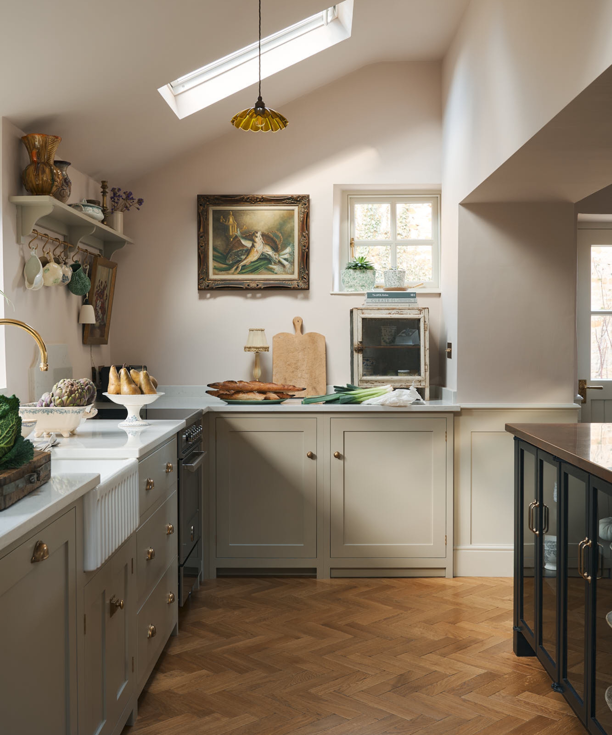
It's no secret that stark whites are no longer the go-to kitchen color. Cold and clinical, they are the opposite of the warm, inviting schemes most homeowners are craving right now. But shifting from white doesn't have to mean going bold, bright, and colorful – alternative neutrals have the same appeal, just warmer and more nuanced.
'Stark, bright white is a kitchen color I am swapping out. For years, the all-white kitchen was the safe choice, and I understand why. But in winter climates, a cool white kitchen can feel cold and a little sterile, and it shows every bit of daily life. People want their kitchen to feel like the heart of the home, somewhere people gather and linger. Crisp white rarely gives them that feeling,' explains interior designer Jennifer Davis.
From design inspiration and expert advice to the latest products and effortless hosting ideas, CUCINA from Homes & Gardens brings you everything to create a space that’s as functional as it as beautiful.
'Warm, earthy colors that look found rather than chosen: warm grays with a little brown in them, soft olive greens, warm stone, and natural wood. These colors have depth and change with the light throughout the day, so the room feels collected instead of brand new. More and more, the color isn’t only coming from a paint can. It comes from the materials themselves, like a marble with real movement, handmade zellige, or slate. A room in these colors looks like it has a story, which is what people are craving.'
If you aren't used to decorating with these warmer, deeper colors, start with the spaces around the kitchen, like a pantry or back kitchen, to find color confidence. 'A pantry in a warm, moody gray or a butler’s pantry in rift white oak gives the main kitchen a richer backdrop without overwhelming it,' Jennifer adds. 'I also love bringing warmth in through the walls themselves. Venetian plaster or limewash in a soft warm neutral changes the whole feel of a kitchen, even when the cabinetry stays light. From there, I layer color into the places people touch and see every day, like the window treatment, the range hood, or a coffee bar.'
3. Mid-Tone Blues and Greens Make Way for Inkier Shades

Recent kitchen trends have us all reaching for more confident design features, and color is no exception. As such, safer, less confident shades are starting to feel less exciting – especially when moodier options are on the table. And for some designers, the darker, the better.
'I'm replacing the mid-tone blues and sage greens that became the safe way to add color. That’s exactly the problem: every kitchen ended up the same polite shade of farmhouse, but make it calm. They sit in the middle, not light enough to feel airy and not deep enough to feel rich,' says John Maloney McNamara of Coosa.
'For color, I’m going deep: inky navy and greens with black in them. They feel tailored rather than trendy; they make brass and unlacquered hardware glow, and they give a kitchen the weight of a room that was built, not just painted,' he explains, adding that committing to these deeper tones is the best way to introduce them to your kitchen.
'The cabinetry sets the color and the walls follow it, either in tile glazed in a similar shade or in the same stone as the countertops, so the whole room reads as one color. In navy or deep green, that makes a kitchen rich and enveloping. I’d never split the difference: navy lower cabinets with white walls and white uppers look like the color lost its nerve halfway up. A kitchen with a pop of color looks dated and decorated. A kitchen that commits to one looks designed.'
4. Cool Neutrals Switched for Cheery Yellows
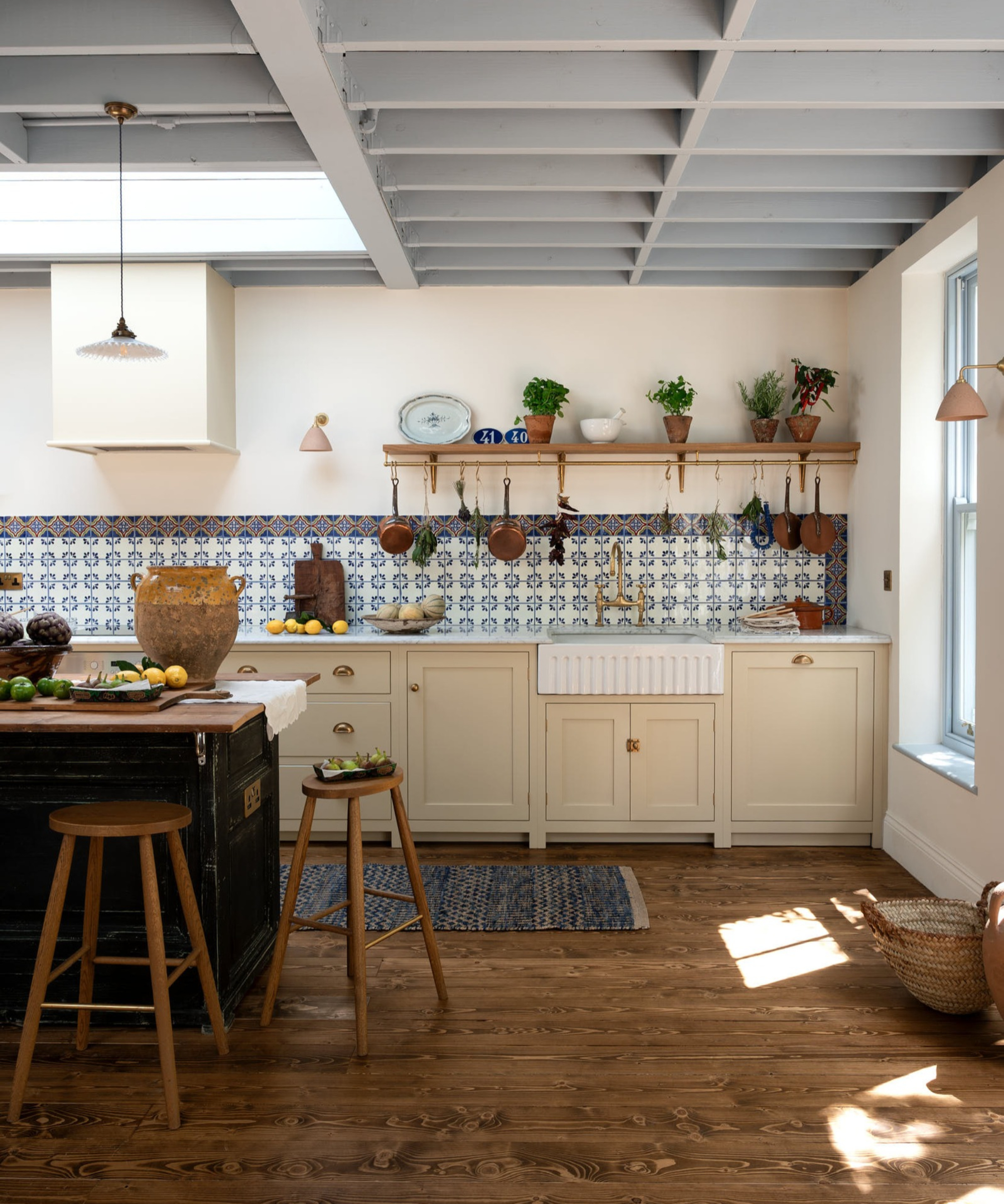
There's a common theme with kitchen colors right now – cold neutrals are out, and designers are looking to several alternatives to give spaces a bit more interest and personality. That's not to say neutrals are out, but a fully white kitchen feels a little boring, so even small infusions of color can make a difference.
'I think the question for homeowners right now is: if not white, then what? Here in the South, we tend to have very traditional kitchens, and I'm trying to move away from the all-white kitchen while honoring my client's desire for something ,' says Katie Kiser of Katie Kiser & Co. Instead of playing it safe, she suggests embracing more joyful colors that bring personality to a design.
'We are leaning toward soothing, happy colors like yellow and blue. We are using a lot of dark mahoganies and rich wood textures to really make the kitchen feel lived in. My favorite way to introduce color into a kitchen is undoubtedly through textiles. Whether it is a shaded fixture, a Roman shade, or a punchy counter stool, textiles are the easiest way to pull color through the kitchen.'
5. Beige Replaced By Muddier Tones
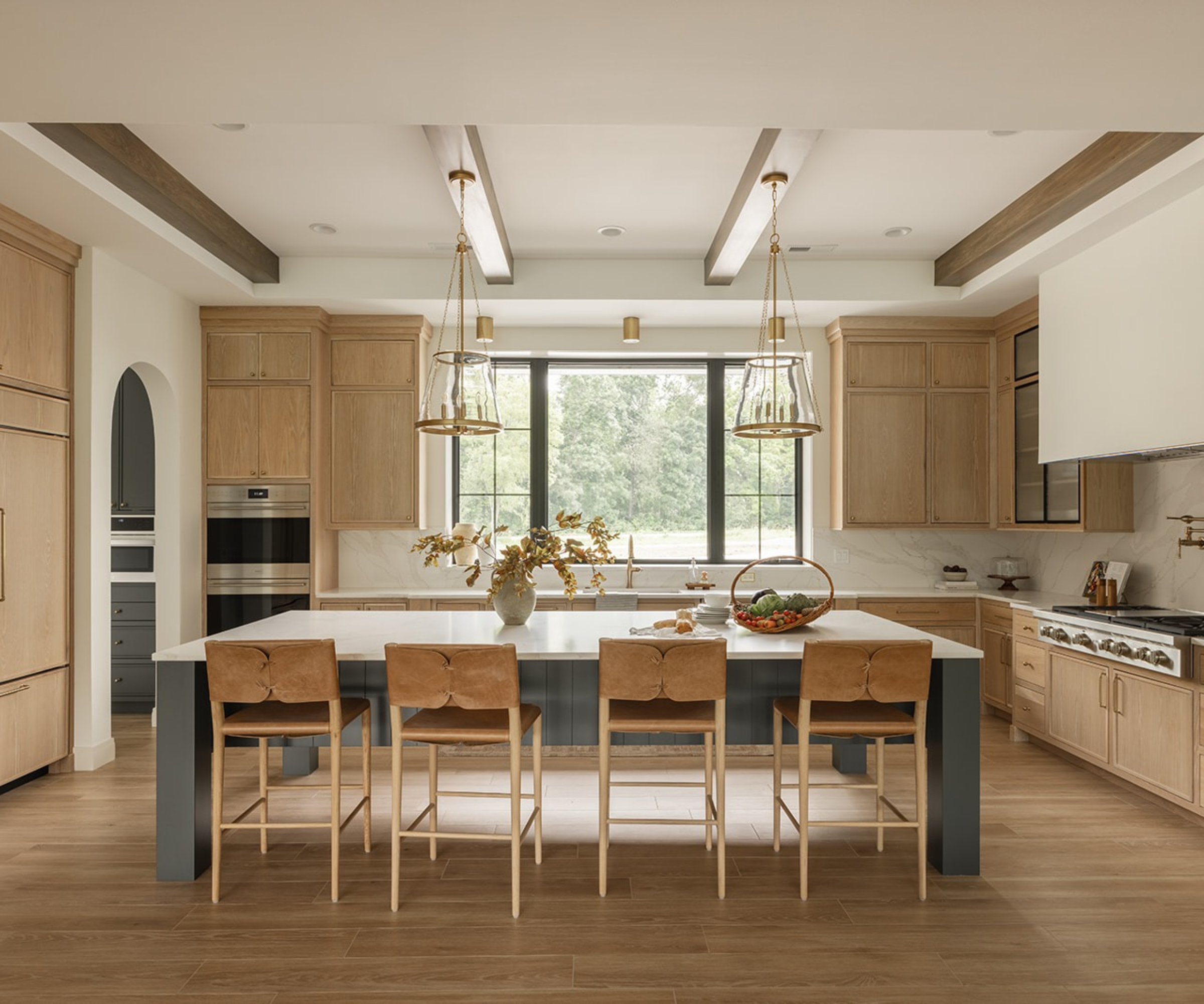
Beige has fast become a warmer alternative to white, and while this age-old neutral isn't going away any time soon, designers say in some cases, there are other shades that bring a more layered, characterful feel to kitchen designs.
'I’m finding myself moving away from entirely neutral kitchens. While I still love a beautiful, timeless neutral, I think incorporating a little color can bring so much more personality and depth to the space! Sometimes an all-white or beige kitchen can feel a little flat without that additional layer of interest,' explains Brooke Mennen-Talsma of Brooke MT Interiors.
'I’m especially drawn to muddy, muted colors that almost act as neutrals themselves. In our Quincy Road Project, we incorporated Sherwin-Williams Rock Bottom, a beautiful muddy blue-green on the kitchen island. It pairs so naturally with the warm wood cabinetry, quartz countertops, and brass finishes without feeling overwhelming or trendy,' she adds.
These muddier colors are incredibly versatile, so even if you don't feel confident enough to paint your entire kitchen in a deeper hue, smaller accents are just as impactful. 'My favorite way to introduce color is through the kitchen island or a smaller section of cabinetry. It allows you to incorporate something unexpected while keeping the overall kitchen timeless. I love when color becomes a focal point without demanding too much attention, adding just enough contrast and interest while still feeling cohesive with the rest of the space and home.'
None of these colors are going out of style; designers are simply finding new shades and palettes that feel more unique and add a warmer atmosphere to spaces of every style and size. Think of them as kitchen colors designers want to see more of, rather than hard and fast rules.
Love beautiful design ideas, expert advice, and inspiring decor trends? Sign up for our newsletter and get the latest features delivered straight to your inbox.