This large family home in Austin, Texas, may look like a calming blend of browns and beiges, of heritage prints and soft edges, of historical charm and carefully chosen modern touches, but its vaguely rustic beauty is all the work of the Britt Design Group, cleverly masking the fact that it was built as recently as 2008.
'It was a total mish-mash!' says studio founder Laura Britt. 'The house had been through some homeowners in its short life, and the last one had done a contemporary remodel that really didn't fit with the tastes of our clients. They wanted comfortable, traditional, cozy, and it was none of those things.'
So Laura, her partner Audra Siao, and their team set about sensitively making the home cozier, adding in lots of little touches that made a big difference to the overall ambiance. 'There was already a nice architectural heft, a thickness to the walls and some nice transitions, but we had to get rid of all the bits that felt too modern,' Laura says. The result is an inspiringly tight palette that comes together to give this home a sepia-toned sense of serenity. 'It's layered, but not fussy,' says Laura of her approach, and as her scheme shows, the tricks are all in the edit.
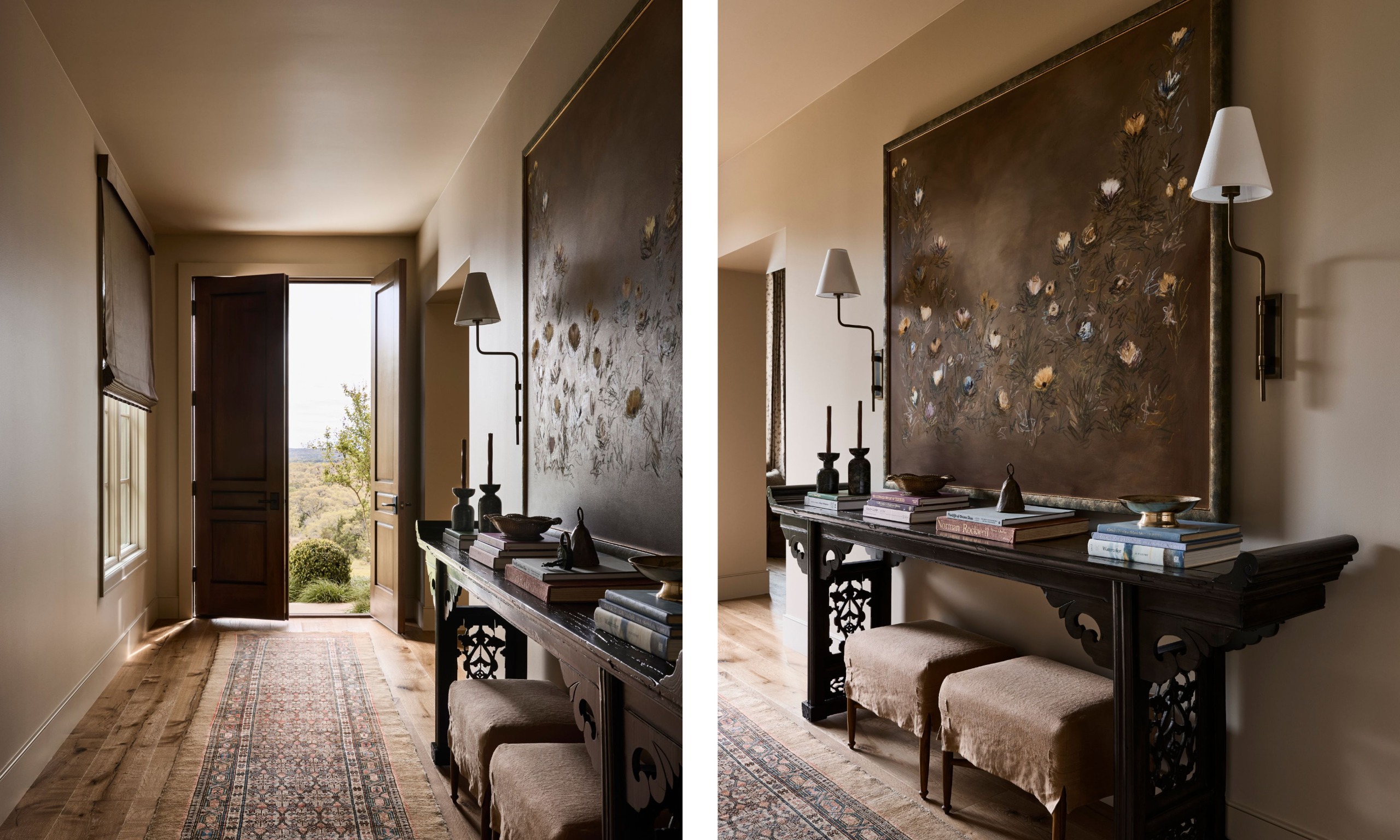
The palette for the home centers around a soporific blend of browns, with many vintage and found pieces helping to create a feeling of being comfortably careworn. 'The look just naturally evolved,' Laura says of how she originally pieced it together. 'We didn't want to color-drench, but felt a neutral base that was deeper than beige and rich in tone would be most interesting.'
The formal entryway sets the tone. 'It's a long hallway, so we wanted it to feel lived-in, layered, and really welcoming,' Laura says. 'Found objects give it richness and patina. That big console along the wall here had originally been distressed red, but we restored it to its natural wood tone and kept it out of the landfill. It now has such a good story.'
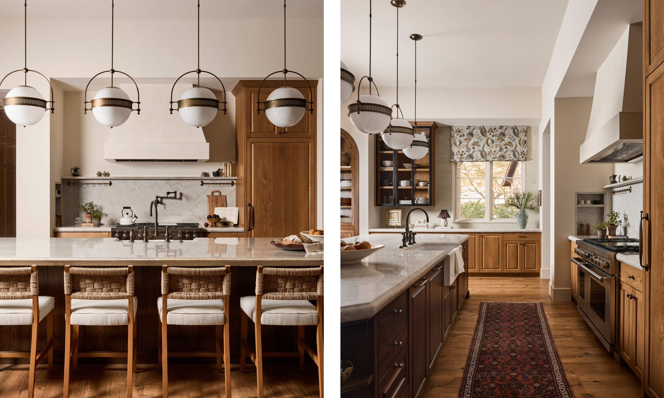
The kitchen keeps to the same color palette as elsewhere – browns, creams, and softness – and, like the rest of the house, boasts some decorative touches despite being a functional space. 'It’s so open to the primary living room, so adding those fabrics was essential to ensure it wasn't sterile,' Laura says of the rug and Roman blind.
Notice that the metal finishes are low in shine, too – they don't have the gleam you might get from a brighter brass. 'All the hardware was aged bronze,' Laura says. 'We didn't feel that bolder brass was right, as it could have been a bit glitzy, and we wanted everything to seem toned down.'
Design expertise in your inbox – from inspiring decorating ideas and beautiful celebrity homes to practical gardening advice and shopping round-ups.
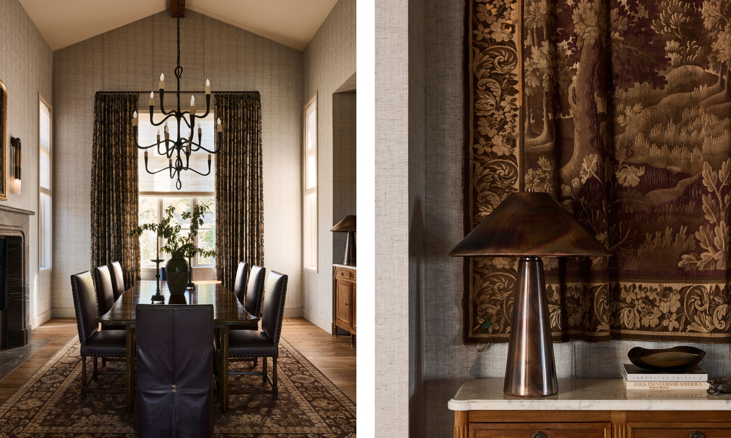
Alongside the palette of browns, there are also some accent notes, specifically burgundy, seen here on the upholstered dining room chairs. 'As a color, it feels very comfortable,' Laura says. 'And adding it to the palette gave a real richness. We wanted a scheme that was restrained but where you weren't afraid to sit on anything. The family had four grown-up kids and dogs, and there are people in and out. It had to be somewhere they could actually use.'
The textural balance was just as important here. 'It was intuitive,' Laura says. 'But there is a nice contrast between the shine of the table and the linen drapery, the copper lamps, and the tapestry on the walls. When you don't have a lot of color, you need to make sure there are a lot of textural changes so that the whole scheme doesn't just feel flat.'
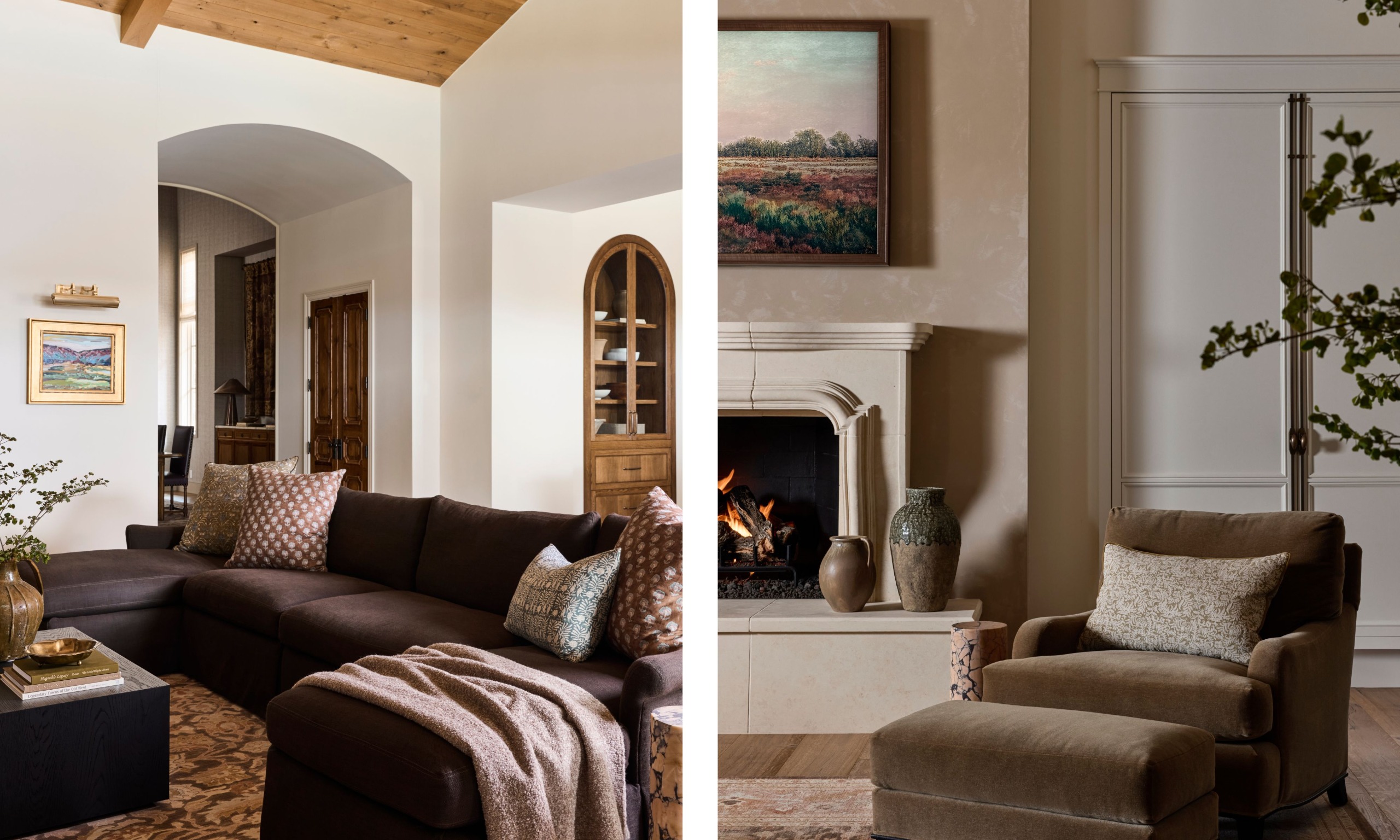
It's not hard to see a slight West Coast influence here, in the Spanish-style arches, the plush textures, the indoor tree. 'The clients have a home in California and love that style of decor,' Laura says. 'For this, we wanted to use that as a starting point, knowing what they like, but look to the East Coast for some of the interior references, and Europe for the furniture. We could see that they were really drawn to quality.'
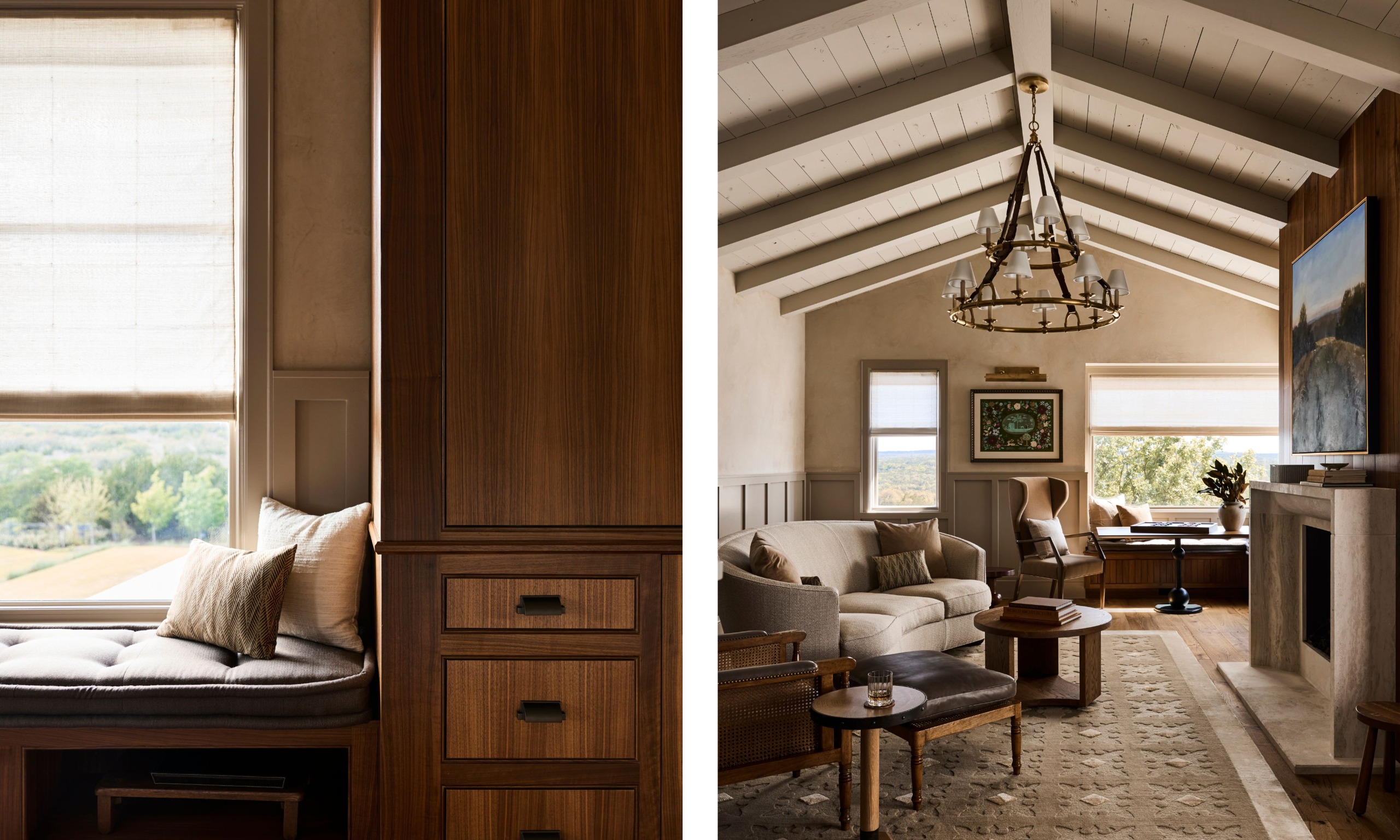
This house is so big (although not big, by Texan standards) that the office has its own living room. It's so relaxing and well-laid out that it's worth including here as design inspiration, though.
There are plenty of different seating options, arranged in pools, an idea that can be carried over to any living area. 'He has employees that sometimes come and work from the home,' Laura said of her client. 'So he needed different stations where they could group together. Also, when you're working, sometimes you want to be relaxed and other times more upright – you have different postures for different times of the day.' An approach that could just as well work in a regular living room too, where you might have both reading and TV and games corners.
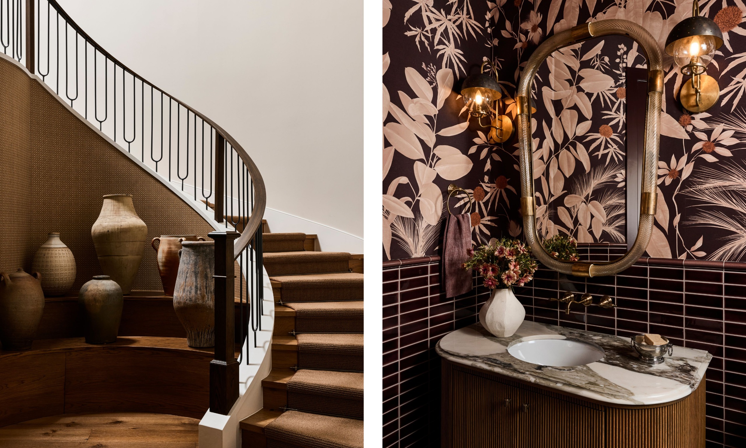
Laura and her team were able to have a bit of fun in the staircase area, collecting and curating these vessels that were found at an antique fair. 'This is the first thing you see when you enter through the garage, which is the way the family arrives at the home most often,' Laura says. 'It has previously been home to a few chairs, but you'd never sit here; it's for passing through.' Instead, the vessels were a way to make you feel at home the moment you arrive. 'Their patina sets a relaxing, comfortable tone,' Laura says.
The adjoining powder room has a different vibe. 'We really wanted it to be a lot of fun,' Laura says. The deep wine color is a link to the chairs in the dining room, helping to create a through line between the spaces.'
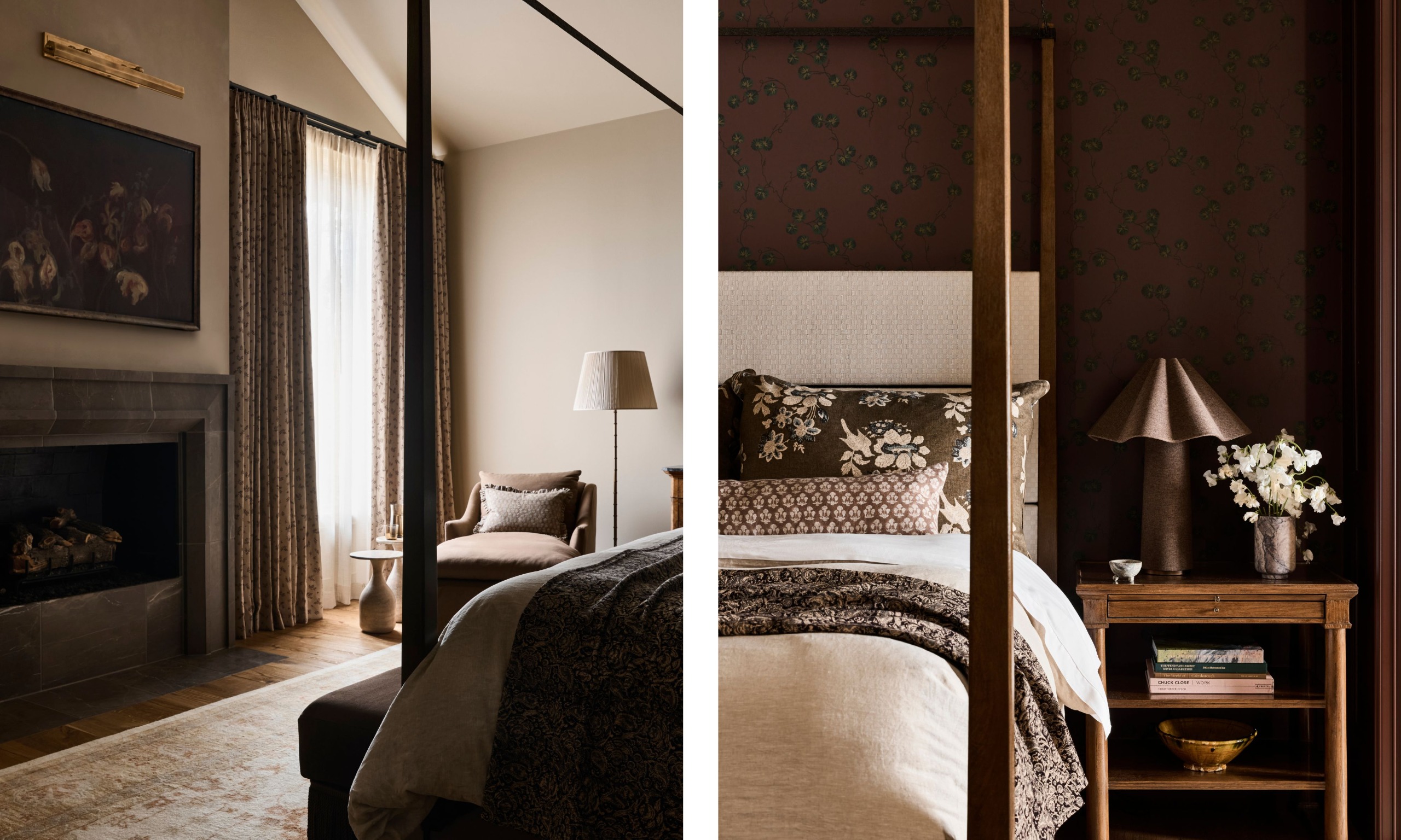
The main bedroom is actually downstairs, just off the main entryway. In keeping with the scheme, it's a pleasing blend of browns and creams, with a sumptuous layering of fabrics over the top. 'We wanted to make sure it felt very welcoming,' Laura says. 'So we mixed old with new, textural pieces, and added a darker fireplace, which made a big difference. It all comes together as one very relaxing space.'
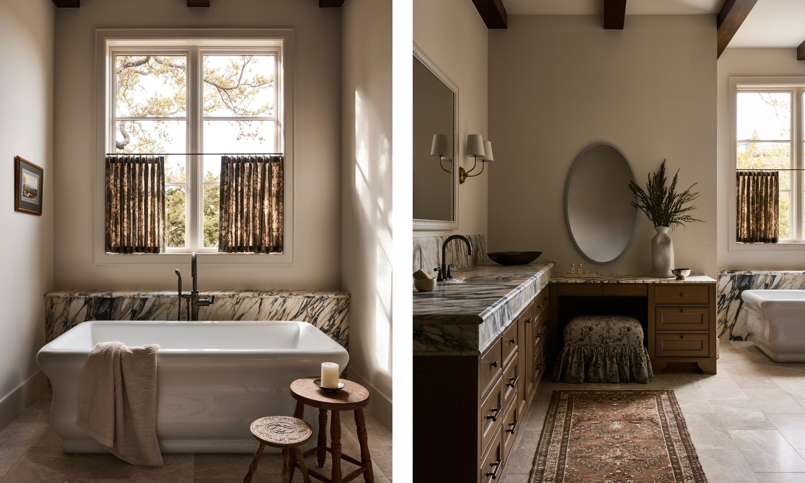
The bathroom is the space that has the most obvious contrast in the house, between the very dramatic stone behind the bath and on the counter and the soft, gentle frills of the upholstery on the stool.
'It's actually quite a large space, so it could take both things,' Laura says. 'If we'd gone all dramatic, it would have been too much, but if we'd gone all frilly, it wouldn't have been enough.' She added that it was 'the thickness of the counter that was very important. It gives the space some heft.'
What the design of this home does is show the importance of the mix. It utilizes texture to make a tight palette feel interesting; it pairs old with new to give the modern bits the charm that comes from patina. It shows that you can do a lot with a limited range of colors, and that brown really is the most comforting color.
Love beautiful design ideas, expert advice, and inspiring decor trends? Sign up for our newsletter and get the latest features delivered straight to your inbox.